'Contemporary set pieces with a more civic attitude to London' in: Financial Times by Edwin Heathcote
05 Mar 2017

Kings Gate and the Zig Zag marry the residential and the commercial in Victoria
Congested, polluted, incoherent and overscaled, Victoria Street in London is not one of the world’s great boulevards. But in its complexity, in the way its mostly postwar fabric is knitted in to (or alien to) the Victorian city that envelops it, the busy thoroughfare does display a distinctive character. A few years ago it was just a route, a channel from Victoria station to the civil service offices that line it. Now it is livelier throughout the day and night but also more corporate, more predictable.
One architectural ensemble does stand out. The pair, Kings Gate and the Zig Zag building, both designed by Lynch Architects, constitute one of London’s finest and most fascinating contemporary set pieces.
Kings Gate is residential, the Zig Zag is commercial. Together they create an expression of this as a genuine, coherent city street, distinguishing function through architecture and giving them the scale and complexity to address views, streets, squares, sunsets and the beautiful Byzantine brickwork of JF Bentley’s Westminster Cathedral across the street.
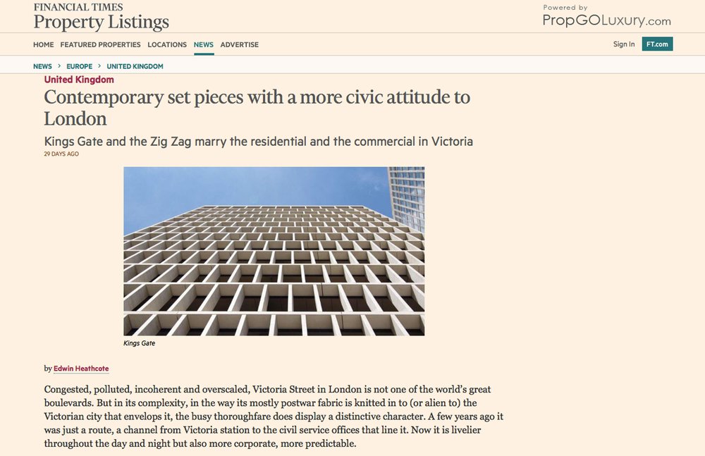
Kings Gate is expressed through a series of shifting stone fins, more densely packed at the bottom and thinning out towards the top. The block is supported on attenuated columns creating a lofty arcade below — echoing the modernist arcades opposite, which are one of Victoria Street’s better features. The solidity of the stone, the generosity of the arcade and the depth and shadow in the façade anchor the building in the streetscape so that it feels part of the city, not like a luxury block imposed on it.
The office building next door, the Zig Zag, is a more complex affair, using shifting angles and setbacks to address different aspects of the neighbourhood. Between them a small civic space separates living from working but assumes they are still part of the same city, the same rhythm of life. Building on a continental European tradition (and inspired by the work of Rafael Moneo, the Spanish architect, and Alvaro Siza, the Portuguese architect, among others), these blocks represent a different attitude to London, more long term and more civic.
Inside, every detail has been considered, from the bespoke door handles to the veins in the stone, creating a richness that is extremely unusual in the contemporary inclination to mass-manufacture architecture as an extrusion of profit from land.
Unusually, Lynch Architects designed the interiors too (usually interior designers take over inside). The result is a more coherent whole in which the terraces and balconies feel like part of the street and the interiors are more engaged with the city.
These buildings do something extremely difficult. They manage to resolve the modernist languages of their neighbors: the striations of Edwardian brickwork and the character of the sturdy mansion blocks with their rhythm of bays and balconies that once dominated the neighborhood. And, more than this, they acknowledge the civic scale and identity of council, government, public and residential buildings through making a piece of street that is, despite the luxury price tags of its flats, a generous and elegant public addition to the cityscape.
Edwin Heathcote

